Agent Learning / Tool Tuner
Beam's AI agents are built from chains of tools, and when one tool produces a bad output, everything downstream suffers. We designed a system that lets users improve tool accuracy by rating past outputs instead of rewriting prompts.

The team and constraints.
Role
Lead Product Designer
Timeline
6 weeks
Team
1 Designer, 2 Engineers, 1 PM
Platform
Web (Desktop-first)
We owned the design end to end: research, exploration, final UI, and handoff. This was a 0-to-1 feature. There were no existing patterns in the product or competitors we could reference directly.
The main constraint: the engineering team had already built the ML pipeline that could auto-tune tool configurations. Our job was to design the interface that collects the right user input, feeds it to the pipeline, and presents the results in a way people actually trust.
The audience ranged from non-technical ops users to prompt engineers who already had their own workarounds. The design had to work for both.
What users were actually doing.
We interviewed power users and reviewed session recordings of people attempting to improve tool outputs. The patterns were consistent:
Most users had never edited a tool prompt
They either didn't know they could, or were afraid of breaking something that "kind of worked."
Power users kept prompt variations in separate docs
They'd copy-paste prompt tweaks and re-run tasks manually to compare results. There was no way to do this inside the product.
No one compared changes against past executions
Even users who actively tweaked prompts had no visibility into how those changes would have affected previous runs.
Users blamed themselves, not the tool
"I probably set it up wrong" was a common response, even when the tool configuration was genuinely the problem.
The problem in their words.
“I know this tool's output is wrong, but I don't know how to make it better. I can see what a good result looks like, but I just can't tell the system what I want.”
— Beam user, operations team
Users could spot bad outputs instantly. The problem wasn't judgment. It was that there was no structured way to feed that judgment back into the system.
This shifted our framing. The design problem wasn't “help users write better prompts.” It was “let users teach tools through examples instead of instructions.” That reframe shaped every decision that followed.
No feedback loop
Users had no way to turn past experience into future improvement.
Prompt-gated improvement
Only users comfortable with prompt engineering could iterate. Everyone else was stuck.
Cascading inaccuracy
A poor output at one step degraded every downstream step in the workflow.
What we tried before this.
We explored three different approaches before landing on the final design. Two didn't survive, but each one shaped the direction.
Approach A: Prompt editor with AI suggestions
DiscardedNon-technical users froze at the prompt editor. Even with AI-suggested edits, the mental model of "writing instructions for an AI" was too abstract. Most participants said they wouldn't use it.
Approach B: Side-by-side output comparison
Partially adoptedUsers responded well to comparing outputs because it gave them confidence in their own judgment. But comparison alone wasn't actionable. "This one's better" didn't lead anywhere. The comparison pattern carried forward into the final design's verify step.
Approach C: Rate, tune, verify
Final directionInstead of asking users to write better prompts, we asked them to judge outputs. Rating is natural. Everyone can tell you if something is good or bad. The system handles the prompt engineering based on those ratings.


Surface it where the pain is.
Rather than adding tool tuning as a settings page, we placed the entry point at the three moments where users are most likely to encounter a bad output and want to fix it.
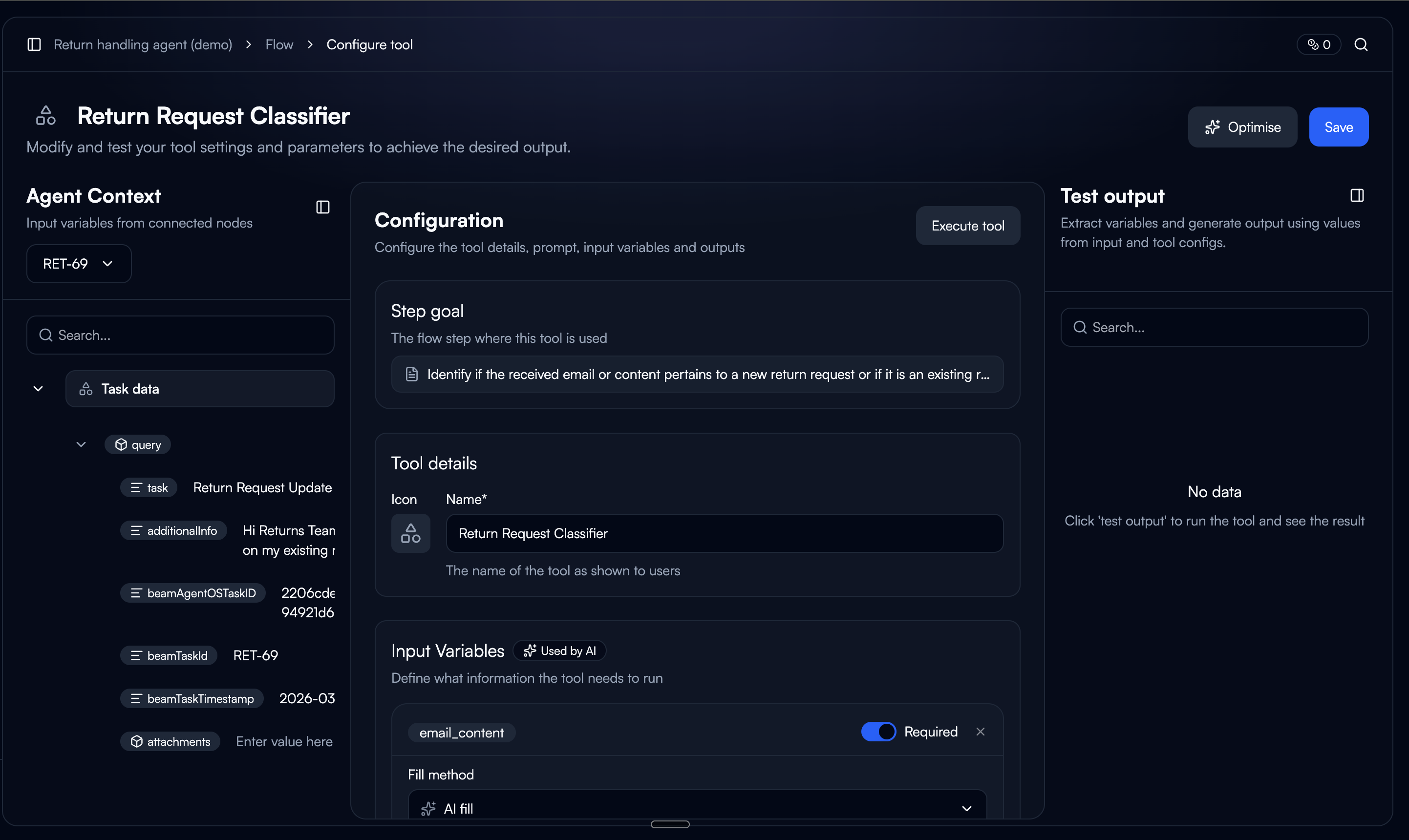
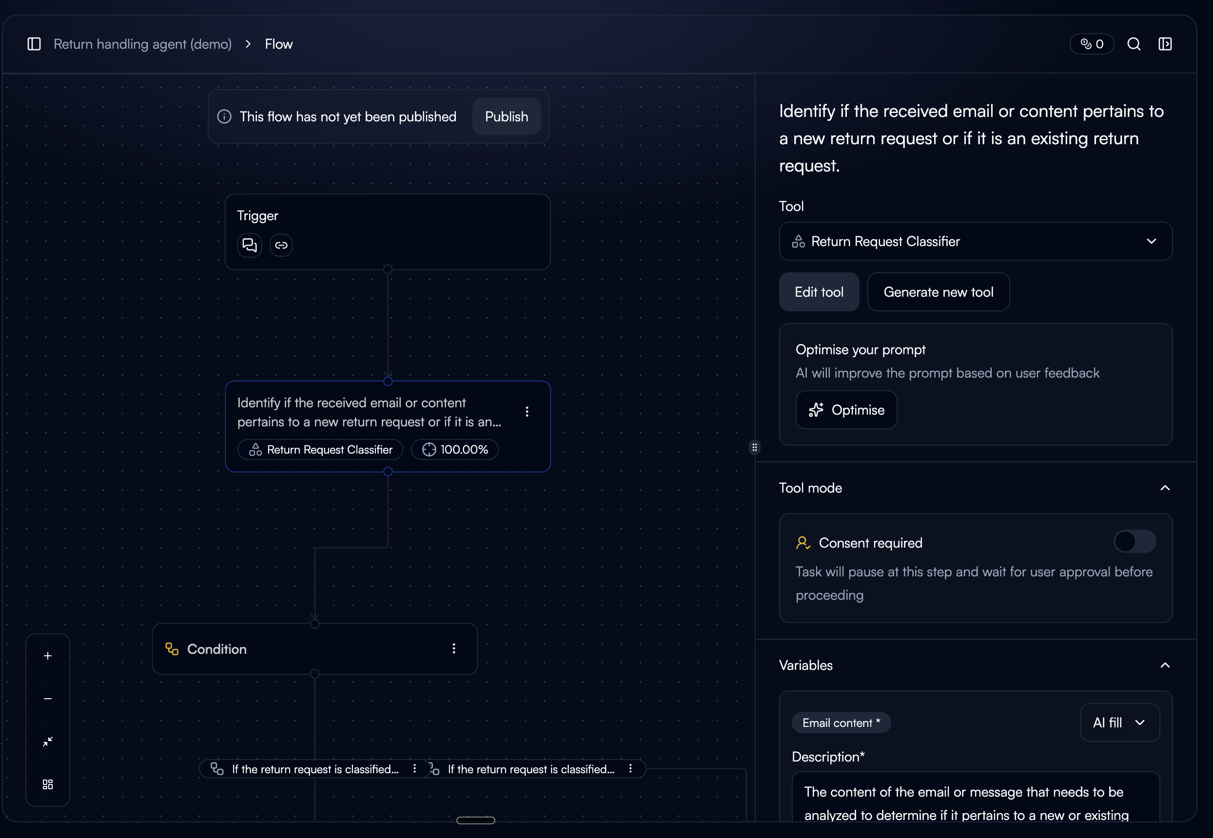
Tool Detail Page
The CTA only appears when the tool has past executions. Showing it on a new tool with no history would raise the question, "tune based on what?"
Node Sidebar (Workflow Builder)
Accessible while building workflows. Also gated by execution history. Users in the builder are already thinking about tool behavior, so it's a natural moment to improve it.
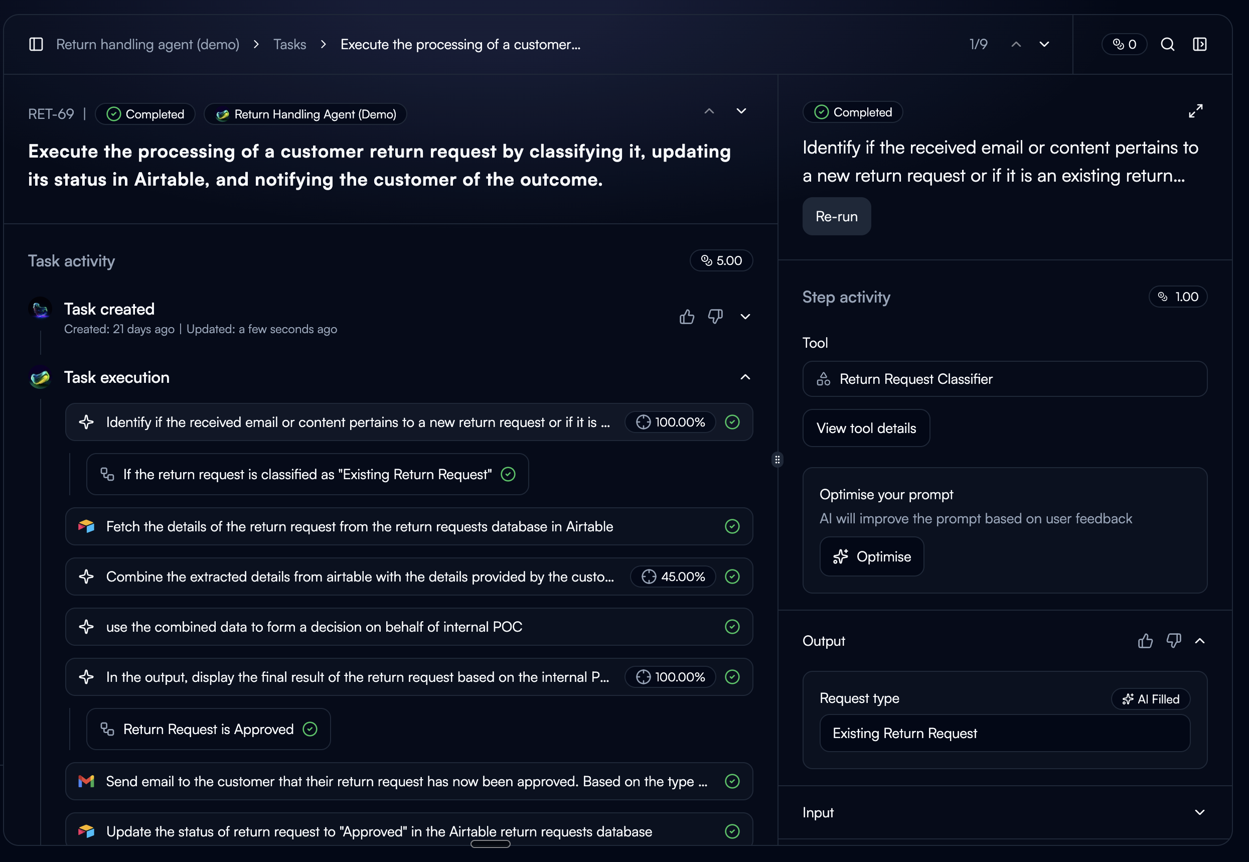
Task Step Sidebar
Always visible. The current execution is pre-selected as a starting point. This is where users see bad output firsthand, so the intent to fix it is strongest here.
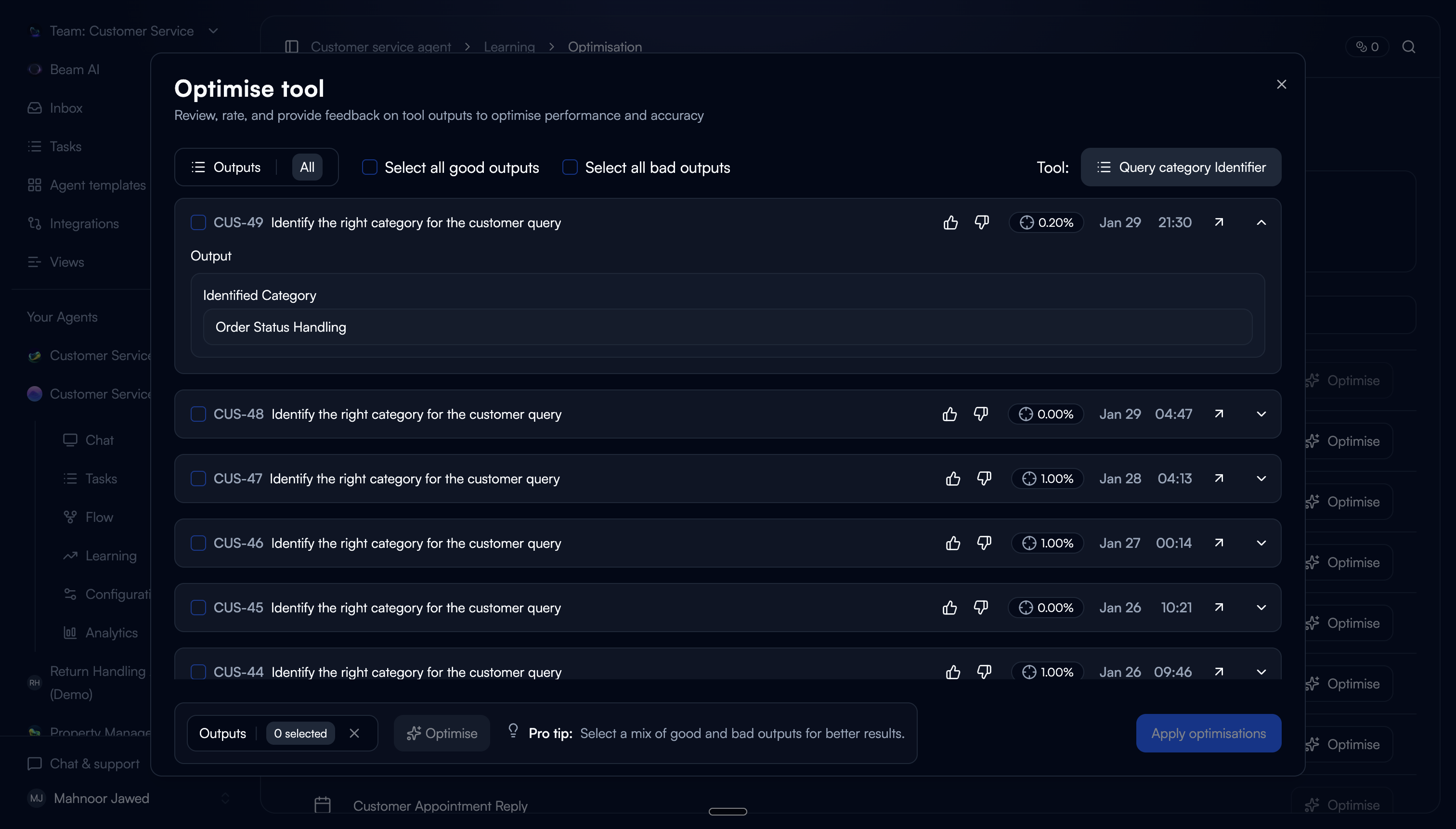
Judge the output, not the prompt.
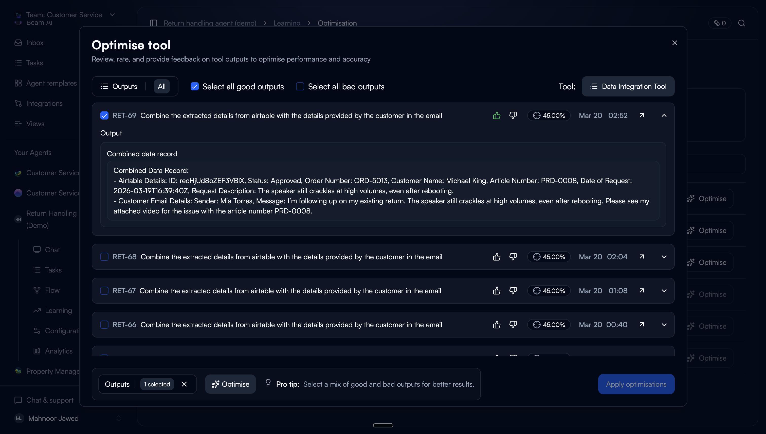
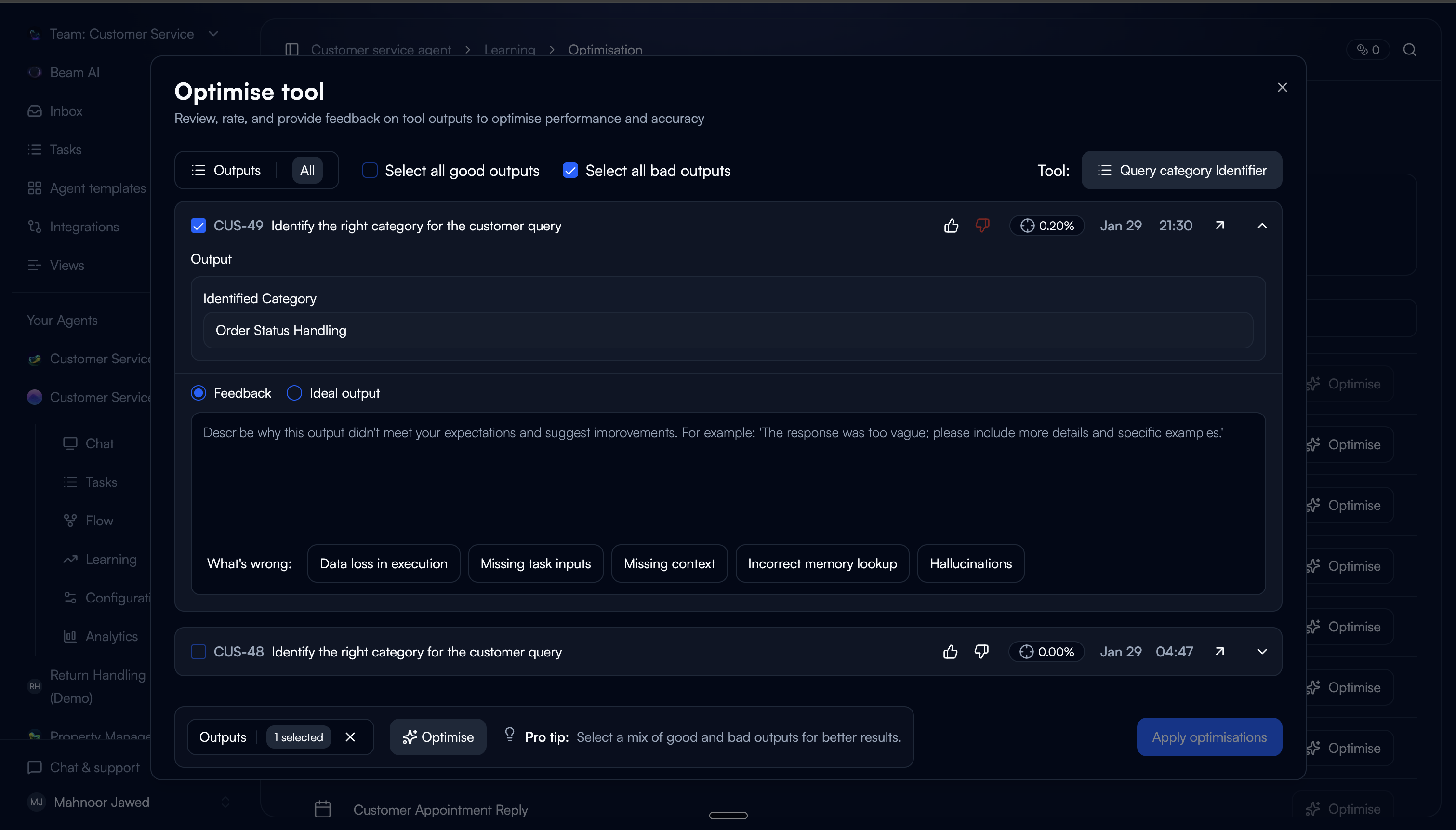
The first step asks users to review past tool executions and rate them as good or bad. This is the core interaction: you don't need to understand prompting to know whether an output is right or wrong.
One deliberate friction: users have to rate an output before they can select it. This ensures every selected execution carries a quality signal for the tuner, not just a user's arbitrary pick.
Pre-populated ratings
Outputs that were already rated in task steps carry over automatically. Users don't repeat work, and the system starts with existing data.
Rate to select
Rating auto-selects the output. You can't select without rating first. This was intentional because it guarantees the tuner has signal on every input.
Structured feedback on bad outputs
For bad ratings, users can provide textual feedback (with predefined categories) or paste an ideal output. Categories lower the effort vs. writing feedback from scratch.
Good outputs as grounding
Good-rated outputs are pre-selected and used as positive examples for the tuner. A mix of good and bad inputs produces the best tuning results.
Trade-off: We limited the default view to 20 executions with scroll-to-load. An earlier version showed all available executions, but users felt overwhelmed and didn't know where to start. 20 gave enough variety for tuning without making the task feel open-ended.
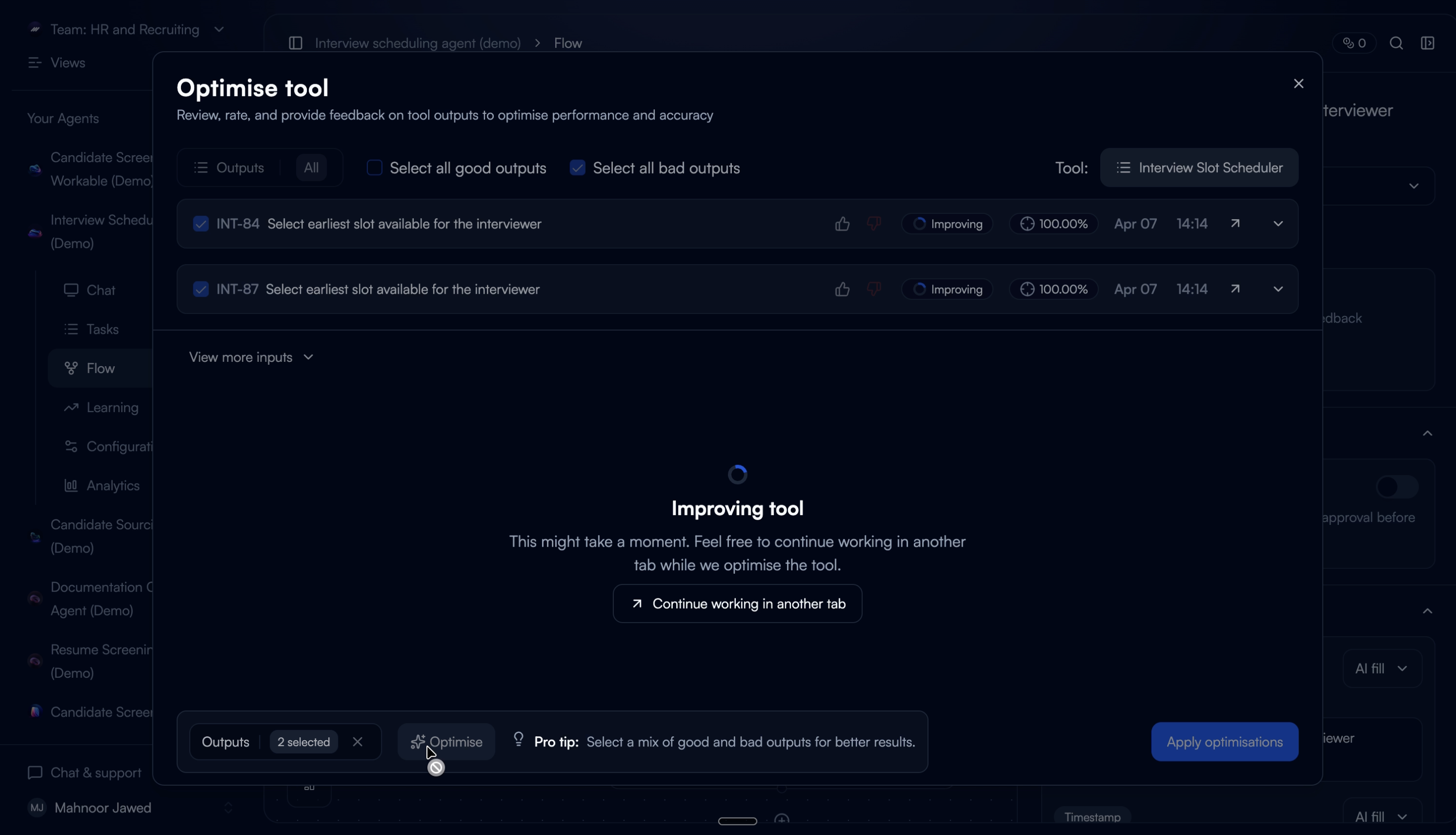
Let the system do the rewriting.
Based on the collected ratings and feedback, the auto-tuner optimises the tool configuration across five areas. The user sees the result as a reviewable diff, not a black box.
We chose to show the full configuration diff rather than just applying changes silently. In testing, users who couldn't see what changed didn't trust the output. Showing the diff built confidence. Even when users didn't understand every individual change, seeing that changes were specific and scoped (not a total rewrite) made them comfortable proceeding.
What the auto-tuner can change
Rewrite the tool prompt based on feedback patterns
Add or remove input variables
Adjust input variable config (fill type and description)
Add or remove output variables
Refine output variable descriptions
Show the proof, not just the claim.
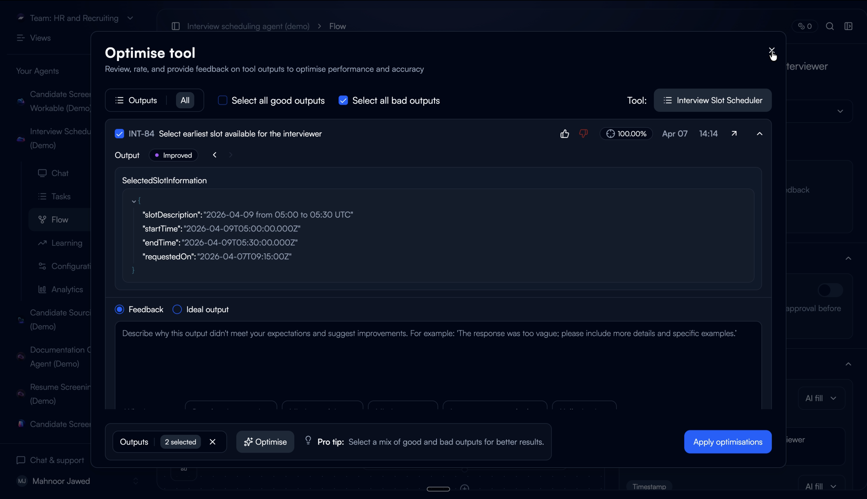
The tuned configuration regenerates outputs from the selected past executions as temporary previews, not replacements. Users see the improved outputs alongside accuracy scores and can toggle between the original and improved version.
This step exists because of a failure in an earlier iteration. When we designed a version that auto-applied changes without a verification step, users reverted almost immediately. They didn't distrust the tuner. They distrusted not being able to check its work. Adding verification changed the save-through rate completely.
Before / After toggle
Users switch between original and improved output with the accuracy score for each. Seeing both side by side lets them judge the improvement on their own terms.
Iterative improvement
Users can re-rate the improved outputs and re-run the tuner. Each cycle uses the improved outputs as the new baseline, so improvements compound across iterations.
What didn't work: the first version showed only an accuracy percentage without the actual output comparison. Users didn't trust a number they couldn't verify. Adding the real output alongside the score made the metric credible. They could see whether their own judgment matched the number.
Commit with confidence.
Saving applies the optimised configuration directly. The updated prompt, variables, and settings are written to the tool. All future executions use the tuned setup.
We kept this step intentionally minimal. By this point, users have reviewed the config diff and verified the improved outputs. The save action should feel like a confirmation, not another decision.
The complete flow.
What changed.
34%
Improvement in tool output accuracy after first tuning cycle
70%
Reduction in manual prompt edits by tool builders
3×
Faster iteration on underperforming tools vs. manual workflow
What we'd do differently.
Some users didn't know how to start tuning. We assumed the entry points were self-explanatory, but early feedback showed that users weren't sure what “tuning” meant or when to do it. The flow needed a guided onboarding step — a short walkthrough that set expectations before asking users to rate outputs.
The UI felt too cluttered. We tried to surface everything at once — ratings, execution history, config details, and tuning controls — all in the same view. Users told us they didn't know where to look or what to do next. We should have structured it as a guided flow with clear steps instead of a dense dashboard.
Gating it as a pro feature limited our learning. Because auto-tuning was shipped behind a pro paywall, we had a smaller pool of users to learn from. Fewer people meant slower feedback loops and less confidence in our iteration decisions. In hindsight, we would have opened it up earlier — even in a limited form — to validate the experience with a wider audience before locking it down.