Inline Tool Editor & Quick Test
Users had to leave the flow builder every time they wanted to edit or test a tool, losing their place, their context, and their patience. We redesigned the node sidebar to bring the full tool editing and testing experience inline, without navigating away from the flow.
The team and constraints.
Beam's flow builder is where users assemble AI agents, connecting nodes into workflows where each node runs a specific tool. The node sidebar is the primary way users interact with individual nodes. It was the most used surface in the product, and it was incomplete.
The core constraint: the sidebar has limited horizontal space. The existing tool edit page had sections for prompt, input/output variables, agent context, configuration, and testing, all laid out across a full-width page. We had to fit all of that into a narrow panel without making it feel cramped or unusable.
The navigation tax.
We reviewed session recordings and talked to users who were actively building flows. The same complaint surfaced repeatedly: editing a tool meant leaving the flow, which meant losing their place.
The existing node sidebar showed a flat list: tool name, LLM model, input variables, and a few settings (consent mode, evaluation metrics if any). At the bottom, an “Edit Tool” button navigated users to a completely separate page.
The prompt, arguably the most important part of a tool, was invisible in the sidebar. Output variables were hidden too. Users had no way to read, edit, or test their tool configuration without leaving the flow.
Users avoided editing tools mid-flow
They'd note issues mentally and come back later, or not at all. The navigation cost was high enough that they tolerated suboptimal tool configs rather than fix them.
"Where was I?" after every edit
After editing a tool on the separate page and navigating back, users had to re-orient themselves in the flow. On complex agents with 15+ nodes, this took real time.
No way to test tools in context
The separate edit page had a test panel, but it ran the tool in isolation. Users wanted to test with the actual data flowing through their agent, not synthetic inputs.
The sidebar showed too little
The existing sidebar only displayed the tool name, LLM model, input variables, and some settings. No prompt, no output variables. Users couldn't even read their own prompt without navigating away.
The problem in their words.
“Every time I click 'Edit Tool,' I lose my flow. I forget which node I was working on, which connections I was about to make. I just want to tweak the prompt and test it right here.”
— Beam user, workflow builder
The problem wasn't that the edit page was bad. It was fully featured and worked well on its own. The problem was that getting there and back cost too much. Every round trip broke the user's working memory of the flow they were building.
We framed it as a spatial problem: users think in terms of the flow canvas. Tools are part of nodes, and nodes are part of the flow. Editing a tool shouldn't teleport you somewhere else. It should happen where the node lives.
Context switching
Every edit required a full page navigation. Users lost their spatial orientation in the flow.
Incomplete sidebar
The sidebar showed input variables and settings but hid the prompt and output variables, the most important parts.
No inline testing
Testing a tool meant leaving the flow page entirely. There was no way to test in the context of the actual workflow.
The space problem.
The challenge was real: the full tool edit experience included the prompt editor, input variables, output variables, agent context, LLM settings, evaluation metrics, consent mode, and a test panel. The sidebar is roughly 360px wide. Everything couldn't live on screen at once.
We explored a few different approaches to solve the space constraint:
Approach A: Expandable sidebar
DiscardedWe tried a sidebar that could widen to 50% of the screen. It worked for editing, but it covered too much of the flow canvas. Users couldn't see their node connections anymore, which defeated the purpose of staying on the flow page.
Approach B: Everything in a scrollable single panel
DiscardedWe put all sections in one scrolling sidebar. The prompt editor alone took up most of the viewport, pushing everything else below the fold. Users had to scroll constantly between the prompt and input variables. It felt like the edit page crammed into a narrow column.
Approach C: Tabbed sidebar + test modal
Final directionSplitting the sidebar into tabs solved the vertical space problem. Each tab shows one concern at a time. For testing, which needs the most horizontal space, we used a modal overlay with a three-column layout. This gave users the full testing experience without permanently eating into the canvas.


Wire-coded, not wireframed.
Instead of designing static mockups in Figma, we wire-coded the entire prototype using Claude Code. We described the interaction patterns, layout logic, and edge cases in plain language, and Claude Code turned them into a working React prototype in hours.
The wire-coded repo became the handoff artifact. Engineers received a running prototype with real component structure, state management, and responsive behaviour, not a Figma file they had to interpret. This cut the feedback loop from days to minutes and eliminated the usual gap between design intent and implementation.
Prototype built with
Claude Code
Handoff format
Wire-coded repo
Design-to-code gap
Eliminated
Three tabs, one sidebar.
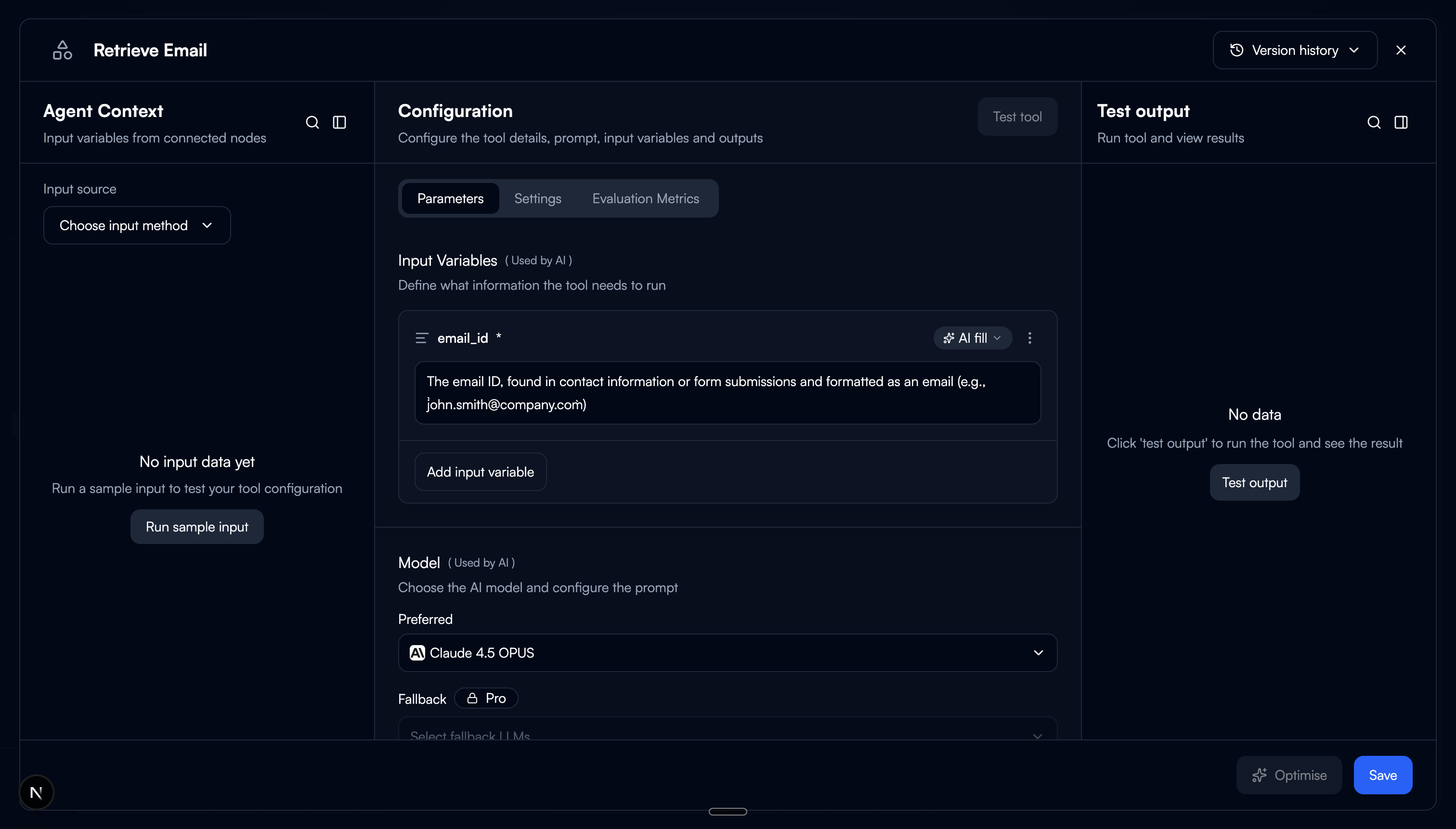
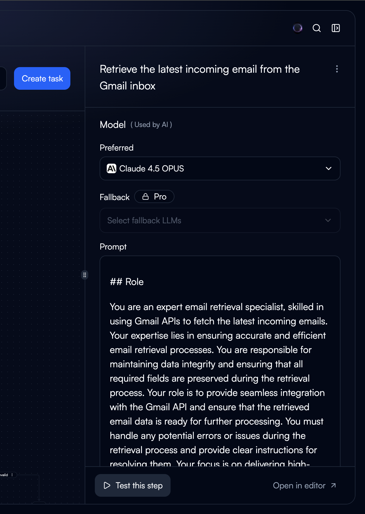
We restructured the sidebar into three tabs, each scoped to a single concern. The tool name moved to the sidebar header, always visible regardless of which tab is active, freeing up space inside the tabs.
Configuration
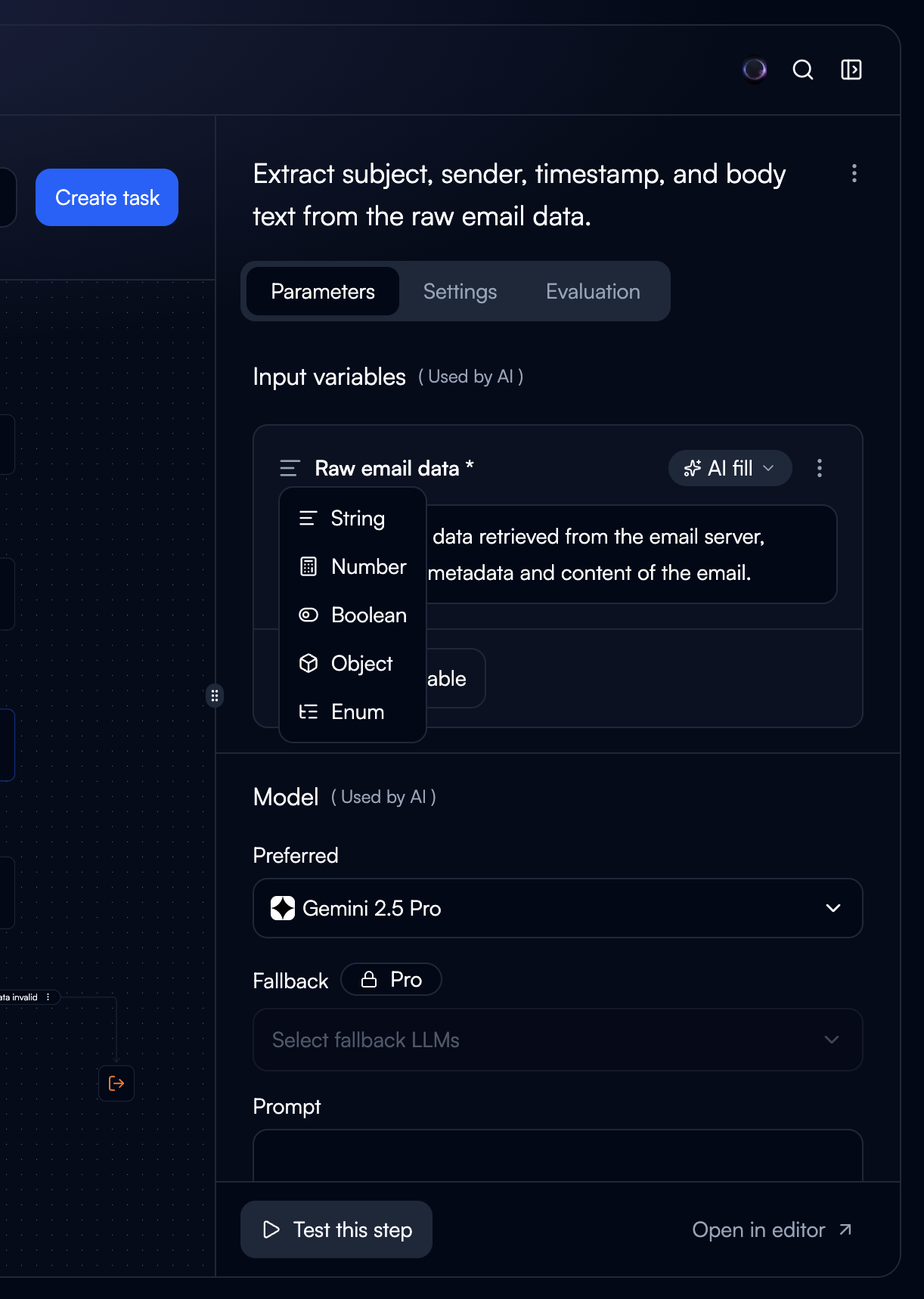
The prompt editor, output variables, and input variables. This is the tab users land on by default because it contains the core of what a tool does. Putting prompt front and centre was the single biggest improvement. Users no longer need to navigate away just to read their own prompt.
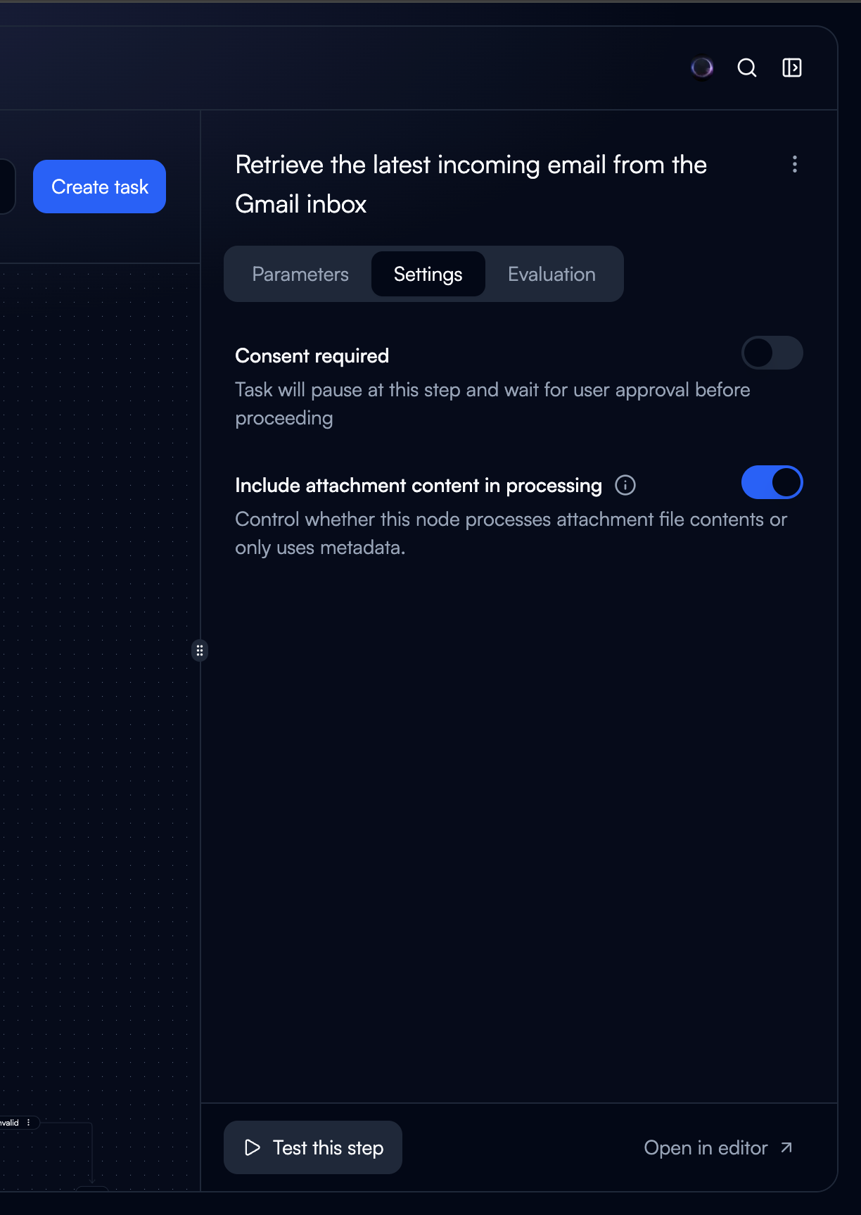
Settings
Consent mode, LLM model selection, auto-run behaviour, failure handling. These are set-and-forget options that don't need to be visible while editing the prompt. Separating them reduced clutter in the main editing view.
Evaluation
Evaluation metrics and criteria. This was previously mixed in with settings, making both harder to scan. Giving evaluation its own tab made it easier to find and encouraged users to actually set up evaluation criteria.
Trade-off: Tabs mean users can't see settings and the prompt at the same time. We accepted this because the two are rarely edited together. Settings are configured once, while the prompt is iterated on frequently. Separating them reduced cognitive load during the common case (editing the prompt) at the cost of the uncommon case (changing settings while referencing the prompt).
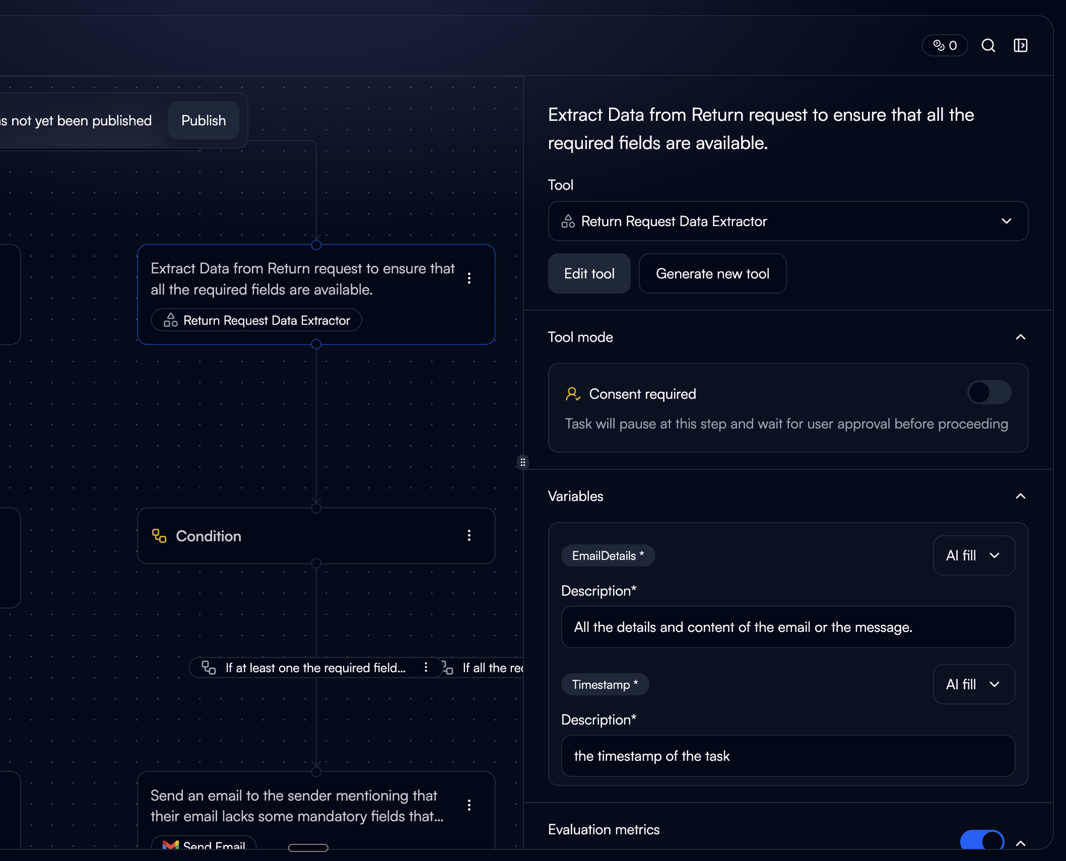
Test without leaving.
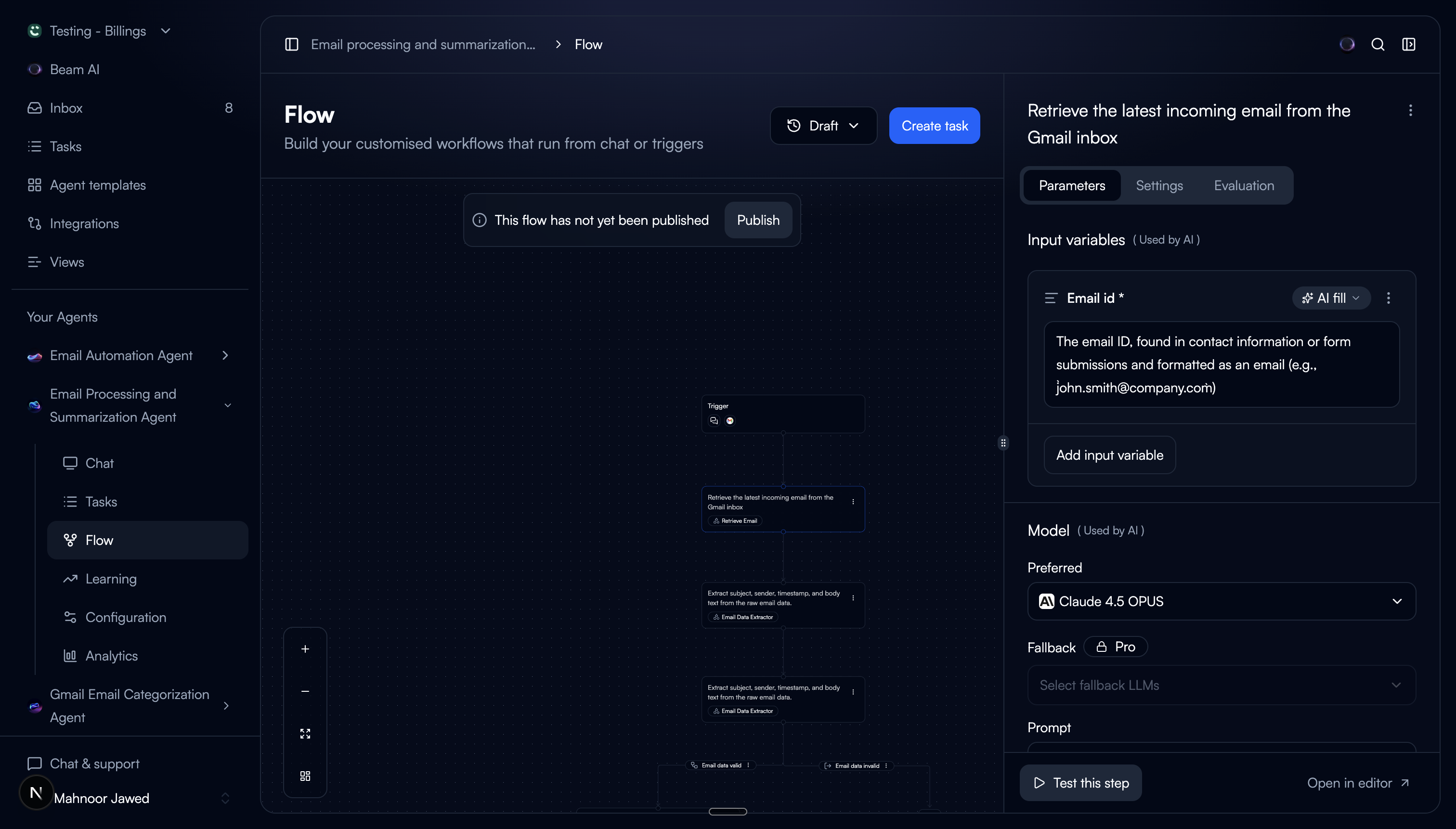
At the bottom of the sidebar, we added a “Test this tool” button. Clicking it opens a modal overlay with a three-column layout:
Agent Context
The upstream data flowing into this node from the agent. Users see what the tool will actually receive, not synthetic test data.
Configuration
The prompt and variable configuration, editable inline. Users can tweak the prompt and immediately re-test without closing the modal.
Test & Output
Run the tool and see the output. Results appear in real time. Users can iterate on an edit-test-review cycle in a tight loop.
The modal is intentional. Testing needs horizontal space that the sidebar can't provide. The agent context, configuration, and output need to be visible simultaneously for the edit-test loop to feel fast. A modal gives us full viewport width while keeping the flow canvas underneath, so closing the modal drops users right back where they were.

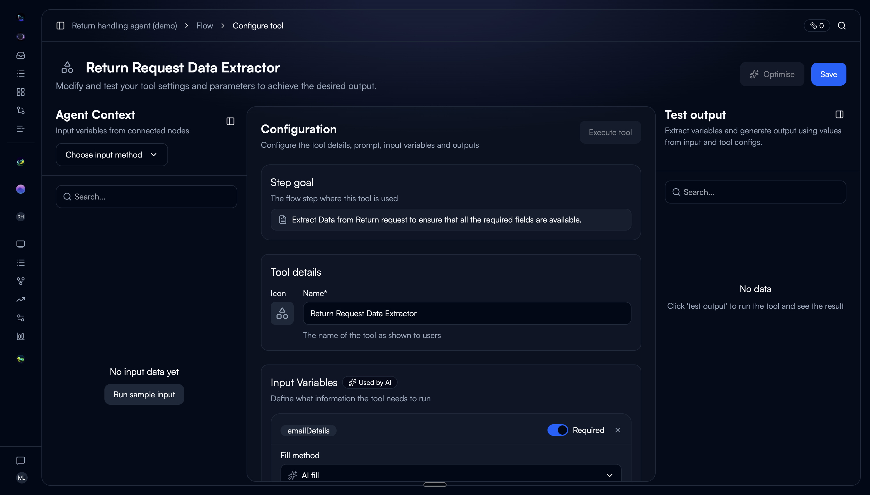
For when the sidebar isn't enough.
We also added an “Open quick editor” button in the sidebar. This opens the same three-column layout as the test modal but as a persistent panel, for users who want more space to work with the tool configuration without the constraints of the narrow sidebar.
The key difference: the test modal is transient (open, test, close), while the quick editor stays open for extended editing sessions. Both keep the user on the flow page. We gave users two levels of progressive disclosure: sidebar for quick reads and light edits, quick editor for deep configuration work.
Why two options instead of one? In testing, we found two distinct behaviours. Some users wanted to glance at the prompt, change one variable, and move on. The sidebar was perfect for that. Others were doing focused prompt iteration across multiple rounds of testing and they needed the space. Forcing everyone into the same view meant one group was always compromising.
The difference.
Before
Sidebar showed tool name, LLM, input vars, and settings only
Prompt and output variables were invisible
"Edit Tool" button navigated to a separate page
Testing required leaving the flow entirely
Users lost their place after every edit
After
Tabbed sidebar: Configuration, Settings, Evaluation
Prompt and output variables visible in the default tab
Inline editing, no page navigation needed
"Test this tool" modal with three-column layout
Quick editor for extended editing sessions
The complete flow.
What changed.
60%
Reduction in page navigations during flow building
3x
Increase in tools edited per session
45%
Reduction in time to test a tool configuration
What we'd do differently.
The tab order matters more than we expected. We initially put Settings as the first tab because it was there before. But users land on the sidebar to check or edit the prompt, and that's the most common action. Moving Configuration to the first position was an obvious fix in hindsight, but it took a round of testing to see it.
The quick editor and test modal overlap more than they should. Both use a similar three-column layout, and some users were confused about when to use which. A future iteration could unify them. The quick editor could include the test panel directly, eliminating the need for a separate modal altogether.
Sidebar width should probably be adjustable. We designed for a fixed 360px sidebar. Some users wanted it wider for prompt editing, narrower when just scanning. A draggable edge would have addressed both, but we scoped it out to ship faster. Worth revisiting.